SportsEngine HQ Dashboard
Creating a membership hub for youth sports administrators

What is SportsEngine HQ?
SportsEngine HQ is software designed for sports organizations to create, grow, and manage their sports experiences – all on one technology platform.
Organizations Served
Daily Active Users
45,000+
20,000+
Teams
Athlete Registrations
1,200,000+
2,100,000+
Hitting the Ground Running
In 2018, SportsEngine product teams were laser-focused on uniting disparate legacy tools under a new all-in-one platform. My team owned the broader navigation and account experiences.
A month prior to public launch, product leadership discovered a major oversight: no team owned the post sign-in "home" experience for this new platform.
My team quickly pivoted our efforts to take ownership of the new home page experience.
This is how the SportsEngine HQ dashboard was conceived.
We had one month to concept, build, and launch a new dashboard experience for over 30,000 users.
Defining the Vision
Who is this new dashboard for?
League administrators including National Governing Body admins, District admins, and Youth Sports Organizations admins.
While their goals and responsibilities overlap, each type of league administrators have different priorities.
Their goals include:
- Understanding membership health – How many members do we have? How much have we invoiced? Any invoices past due?
- Assessing program traction – How many sign-ups do we have for our active programs? How can we better promote these programs?
- Spending less time finding key digital tools – Help me get to my most used tools such as Registration and Programs.
What are the primary product goals?
- Provide high-level summaries of key organization data
- Create clear pathways to the tools admins use frequently
- Define scalable design patterns to simplify key data
Concepting
Within the first week of my team's pivot to owning the home experience, I led multiple alignment meetings with partners across 4 product teams, 3 departments, and 15+ stakeholders to inform product and design direction.
In week two, I moved to visual design. I knew I wanted to create scalable design patterns that were easy to build upon and extend beyond our dashboard experience.
My team mined administrator usage data and prioritized featuring the most used features and most visited pages. You'll see this reflected in the designs.
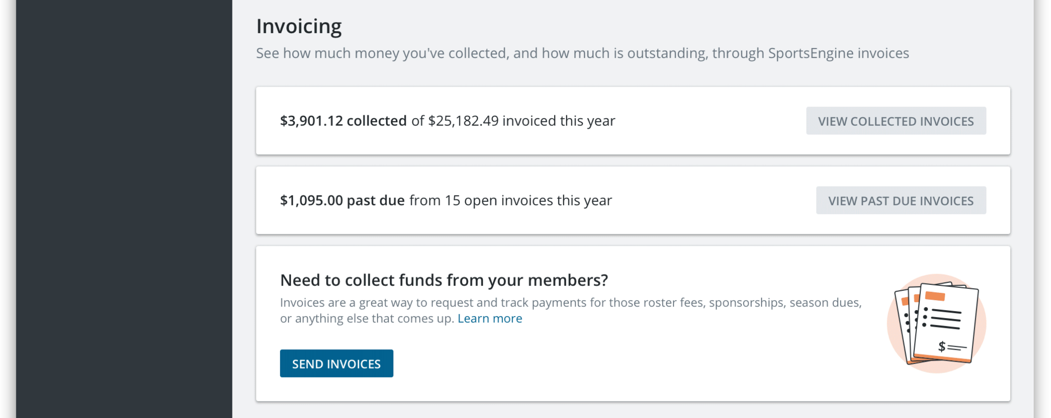
Featured sections:
- Registration data & financials
- Viewing their organization's website
- Viewing invoices, filtered by collected and past due
- Sending invoices
- Program listings and their performance
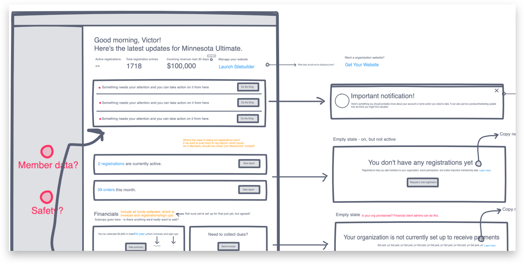
First iteration (not final)


After a handful of internal reviews, we narrowed in on a few key positives and opportunities to help us get to the second iteration.
Positives
- Clean and consistent
- Easy to navigate
- Clear CTAs
- Scalable
- Responsive
Opportunities
- Visually boring
- Lack of key membership data at a glance
- Opportunity to upsell free mobile app companion
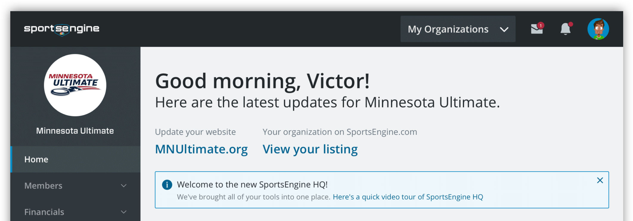
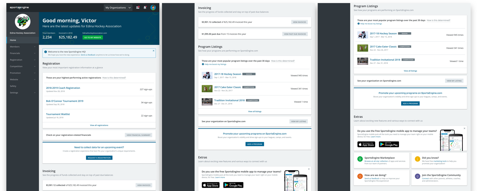
Second Iteration (launched)
You'll notice the changes are subtle. Most of this is due to timeline constraints.
I added contrast and visual brand elements for the header to differentiate from the sections below.
I also included membership KPIs with data we had access to show (without building new endpoints).
Finally, I adjusted some visual elements to better highlight product upsells including a callout for our free mobile app.


Early Build
I collaborated with two lead developers to prototype the designed experience. This was used to present to our stakeholders for cross-department buy in.
So, how did the launch go?
We successfully delivered on time (within a month!), and received positive reviews from our administrators.
"There's no guessing where to find things. It's a seamless experience that puts everything we need to run our club right at our fingertips."
What would I do differently next time?
Looking back on the HQ dashboard, beyond the obvious change of having more intentional time designing, testing, and iterating concepts, I would have wanted to better personalize the experience. There is a tremendous opportunity to enable customization of data and to include meaningful data visualization to highlight sign-ups, invoice, and promotional trends.
The above being true, these launch metrics point towards the overall success of this initial experience:
MQLs from Upsells (First Month)
7-day Retention Rate
200
+12%


